When a visitor lands on most websites, nothing is alive. Text sits on the page. Images hold their poses. The only movement is the cursor blinking back at them. The experience is a transaction — information exchanged in silence.
We designed Living Pages to feel different. Not as a gimmick — as a deliberate neuroscientific choice. Before a user consciously evaluates what's on our page, their visual system has already decided whether this page is alive or inert. We wanted them to register: alive.
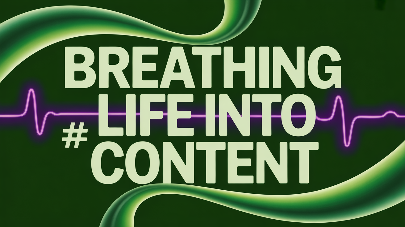
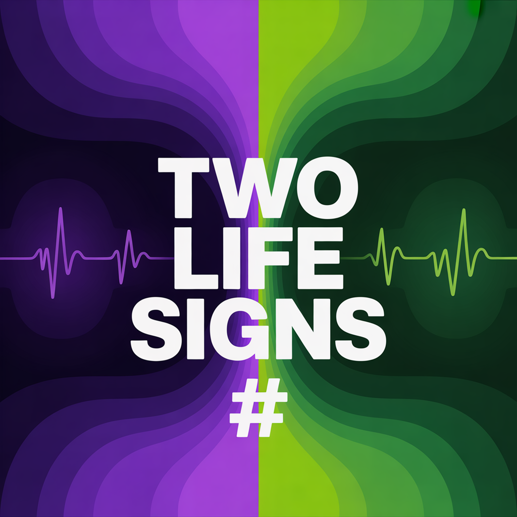
Two Life Signs
Every Living Page carries two animations in its bottom-left corner. Together they act as the page's visual pulse and breath. They are intentionally not synchronized — because life isn't.
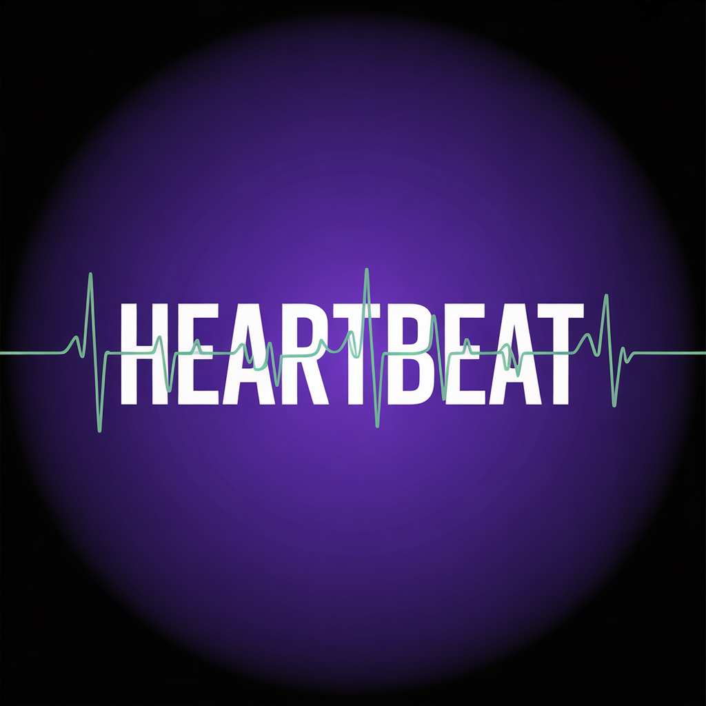
The Heartbeat — The Beacon
A circular pauldolphin badge, always visible in the lower-left. It pulses on a 2.8-second cycle — two quick beats then rest. Scale 1.0 → 1.18, opacity snaps up with each thump. It's the rhythm of a resting heart, translated to CSS keyframes. No JavaScript timers. Just a honest heartbeat pattern that registers with the viewer's nervous system before their conscious mind processes a single word on the page.
Why two beats and not one? Because thump-thump-rest is what humans are wired to recognize. A single pulse reads as electronic — a ping, a notification. A double-beat reads as alive. We're not asking visitors to notice this consciously. We're asking their amygdala to classify this page correctly: present, aware, responsive.
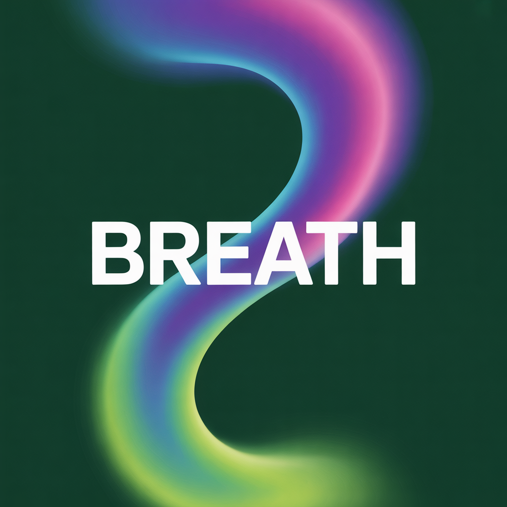
The Breath — The Pill
To the right of the Beacon sits a pill reading "LIVING PAGES ◀◀" with two soft-blinking arrows. The pill breathes on a 4.5-second cycle — slow inhale up to scale 1.05, slow exhale back to 0.95. Opacity follows. The rate matches a calm resting breath, which is deliberate. It is the parasympathetic signal — this page is safe, take your time, settle in.
The heartbeat is sharp and rhythmic. The breath is smooth and continuous. The juxtaposition is what makes the system feel organic rather than robotic. If both animations ran at the same rate, the page would feel mechanical. By letting the two rhythms drift against each other, we replicate the subtle chaos of life.
Why This Matters Commercially
Attention is the only scarce resource on the internet. The average visitor decides whether to stay or leave within seven seconds of landing on a page. Most of that decision is pre-conscious — visual signals reach the amygdala and posterior cingulate cortex before the prefrontal cortex has processed a headline.
Static pages fail this test. They read as closed systems, historical records, brochureware. A page that breathes is read as open, ready, and inhabited. The visitor's brain files it under this is a place, not a document. That classification changes everything downstream — time on page, click depth, conversion, return visits.
The heartbeat and the breath are how Living Pages introduces itself. Before the first word is spoken, before the first image is scrolled, the visitor's unconscious has already answered one question: is this alive? And the answer is yes.
The Invitation
The Beacon isn't just an animation. It's a door. Click it, and a narrator begins walking you through the page. The breath and the heartbeat were the page saying hello. Click it, and you take the page up on the offer.
That moment — the click — is where attention becomes engagement, and engagement becomes contact. For a home loan. For a business funding conversation. For a real estate tour. For anything worth doing on behalf of someone who found you online.
The two life signs are the quiet promise we make on every page. The page is here. It is ready. It is alive. And when you're ready to listen, we'll be here with the first breath.
Living Pages is a Paul Dolphin product. It deploys to any Odoo website and is currently live on select Homestead Capital Partners properties. For more on the technology behind it, visit pauldolphin.com.